Michael Zhu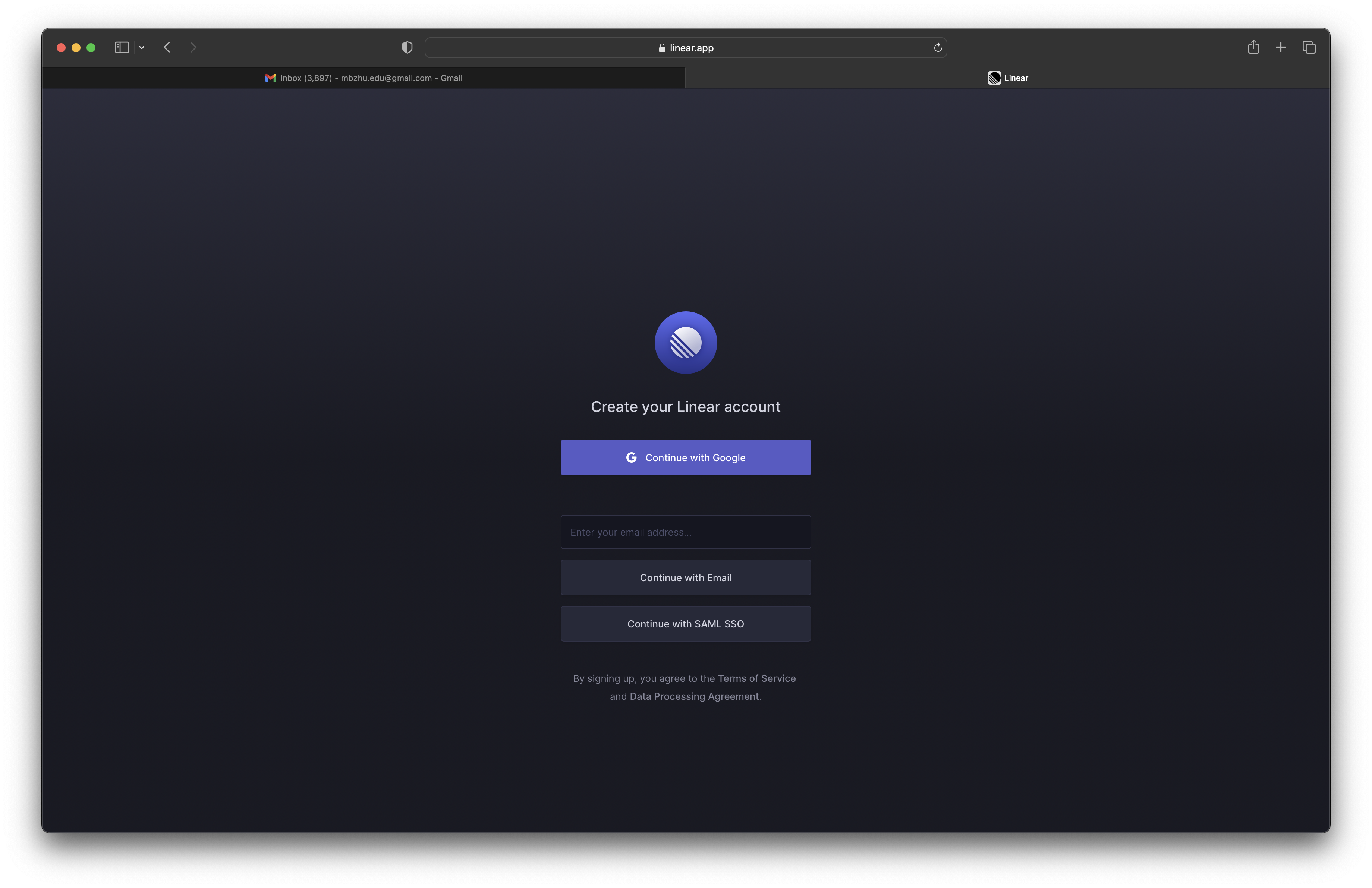
- sign in with email
- you only need email to continue
- no need to think about creating or managing a password
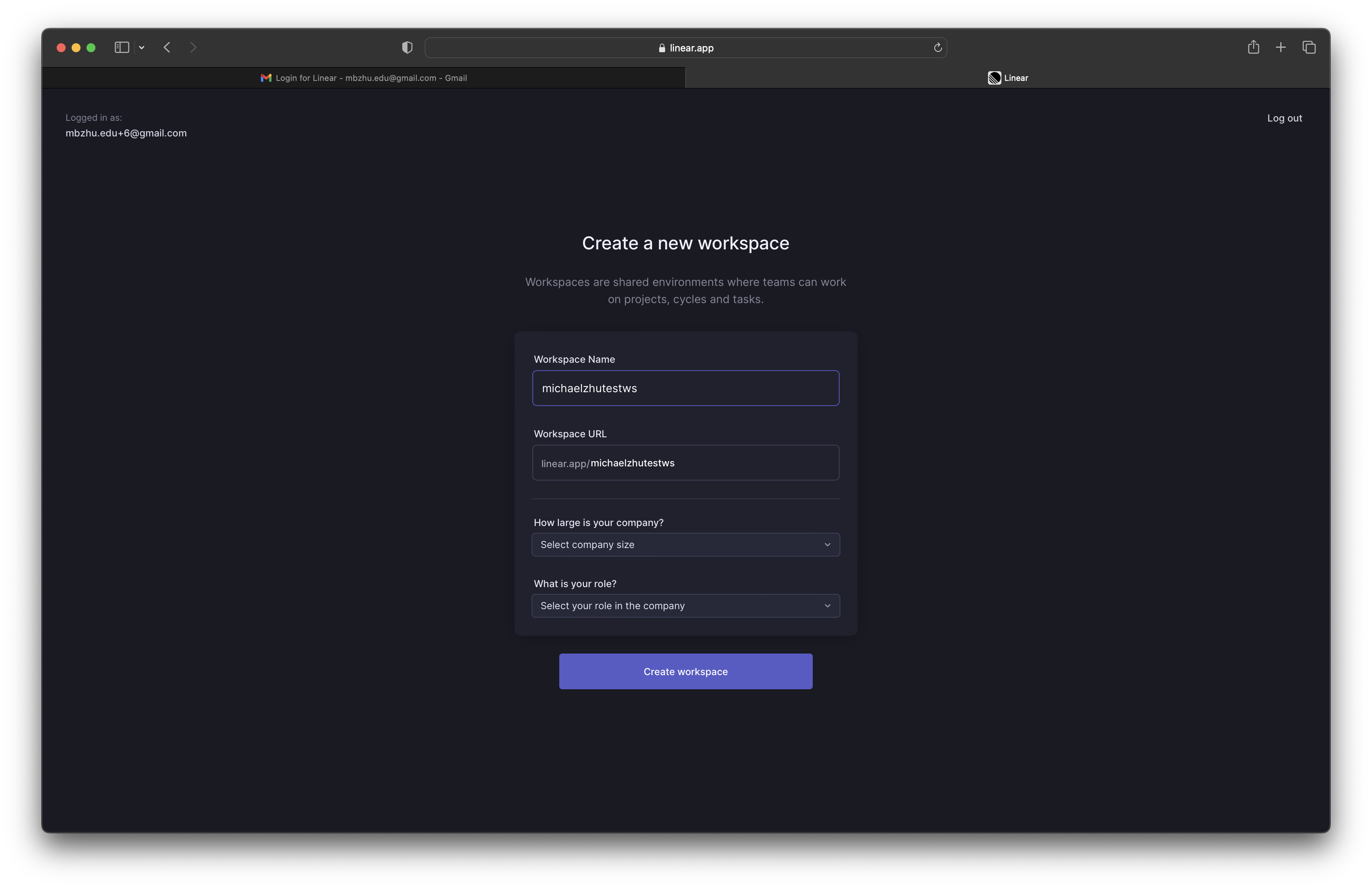
- it’s nice that the workspace url will update as you type in the workspace name as well
- once you make a manual edit to the workspace url, it’ll stop doing automatic updates based on changes to the workspace name
- nit: the workspace url text input is not vertically aligned with the prefix text ‘linear.app/’
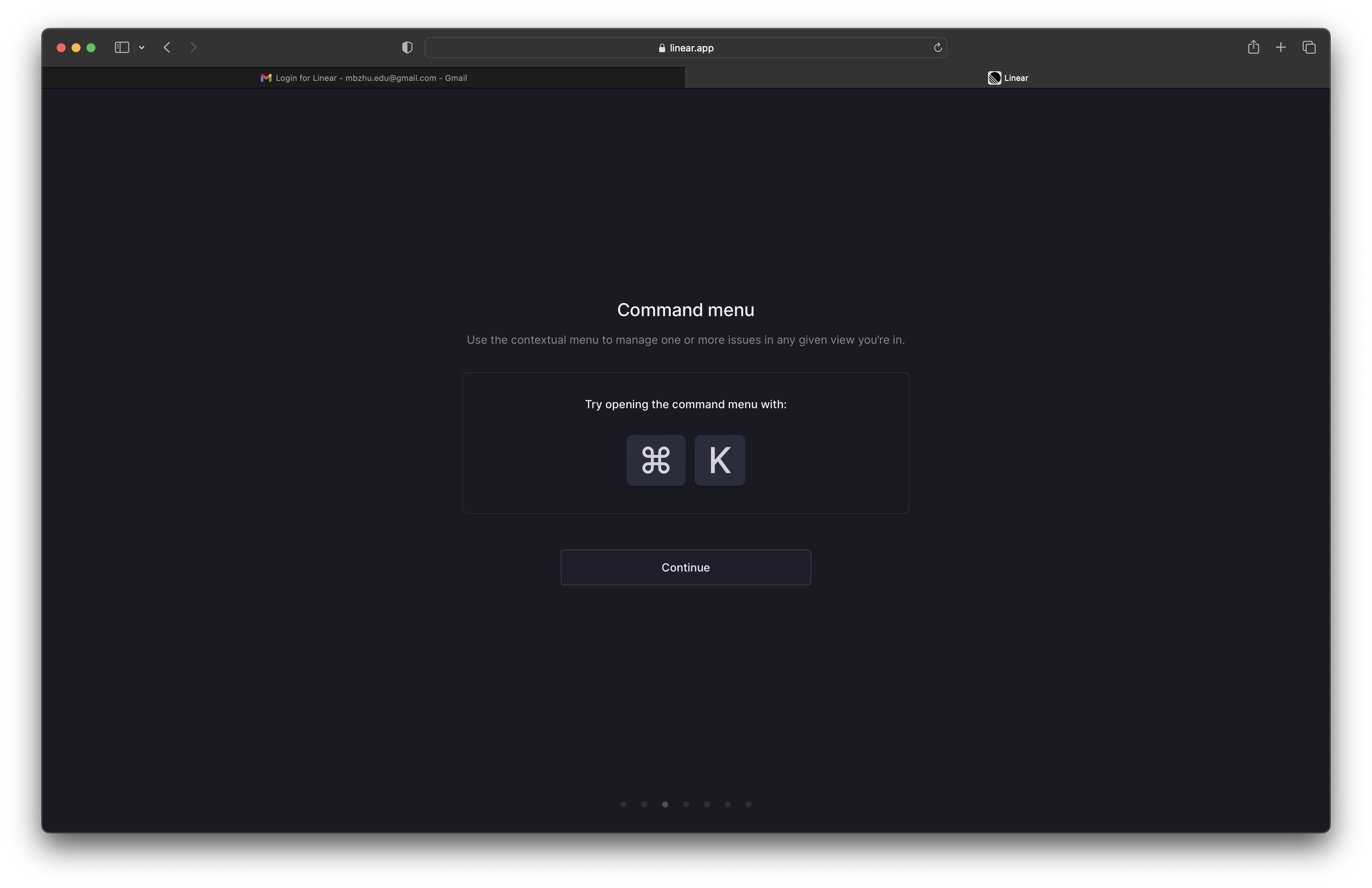
- command menu is highlighted as a key concept in the onboarding flow
- even if the user doesn’t try out the command, they will at least see the shortcut in large bold letters
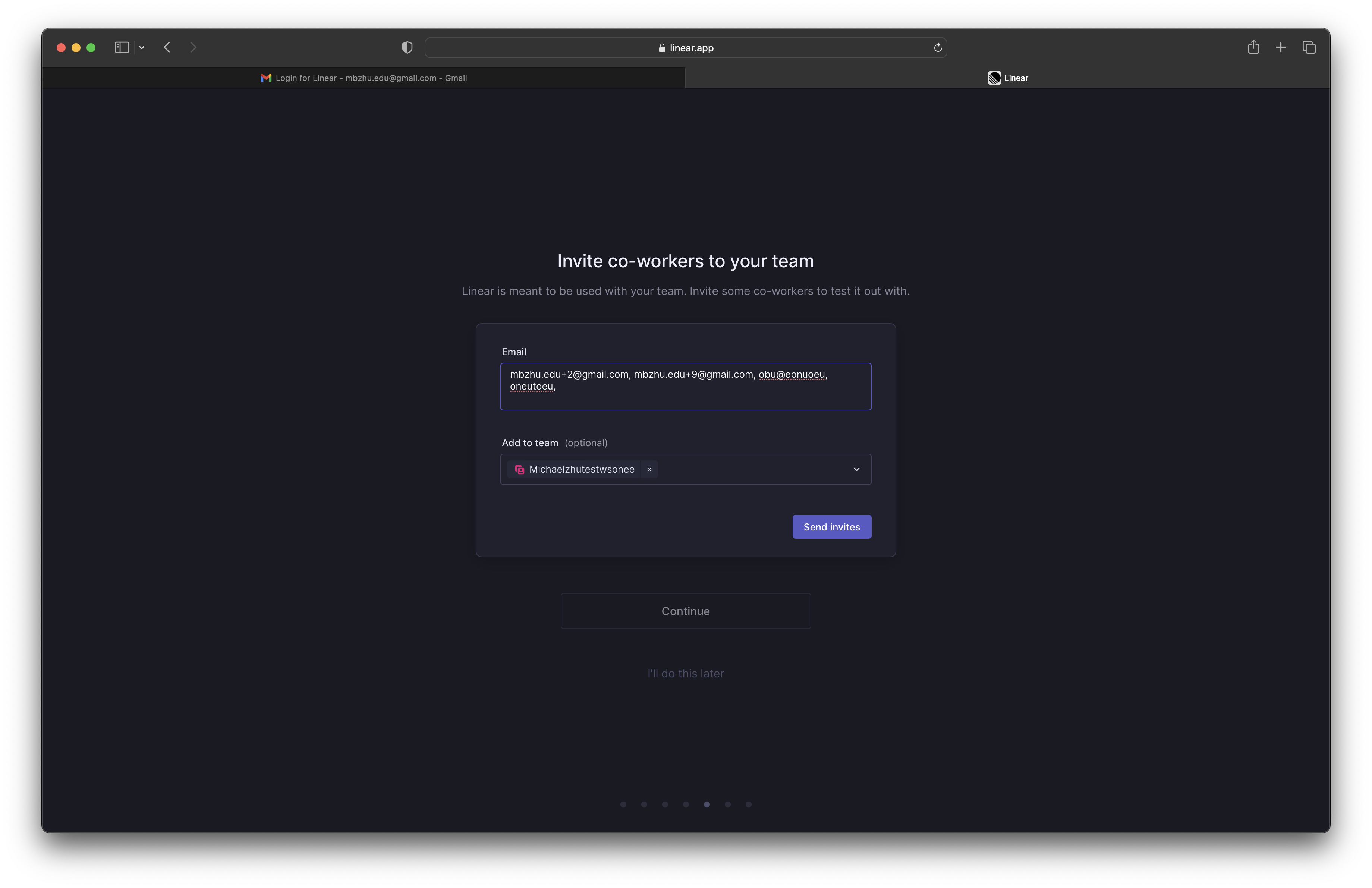
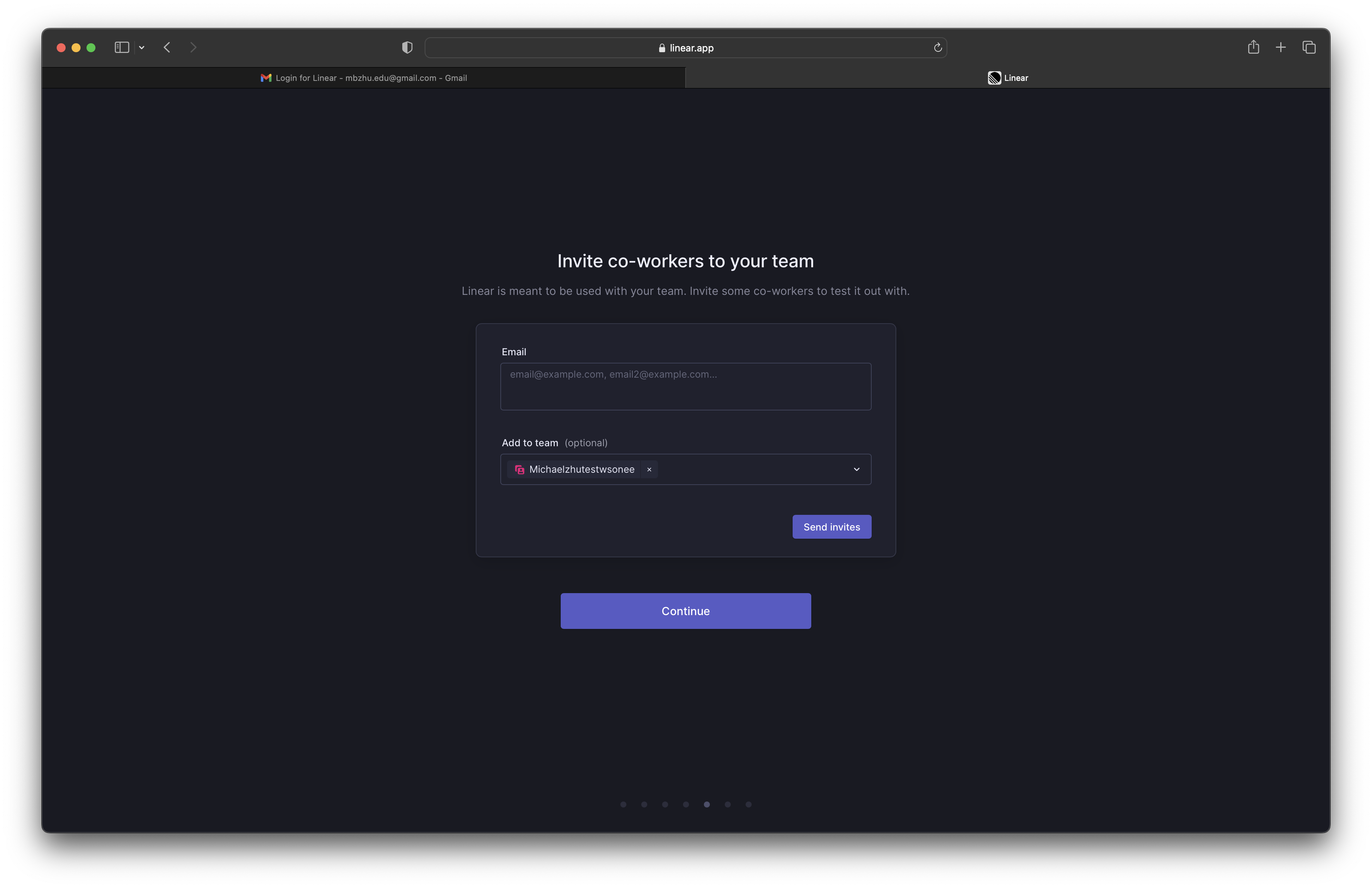
- i don’t like that there isn’t any email validation in this text input
- it’ll do email validation after we click ‘send invites’
- it’s nice that the ‘continue’ button is de-emphasized and is in fact disabled
- ‘i’ll do this later’ is also de-emphasized but is clickable
- it’s not preventing me from progressing but everything visually is prompting me to invite teammates
- i feel like this page shouldn’t show up though if I clicked that my company size is ‘just me’ in the previous page
- it shows a nice little popup notification at the bottom to show that the invite emails were successfully sent
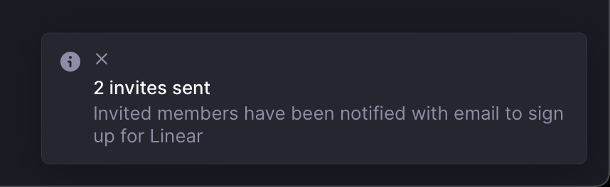
- although the x button seems to be in the wrong location
- after the invites are successfully sent, the ui changes accordingly
- the ‘i’ll do this later’ button disappears
- the continue button is now emphasized and enabled
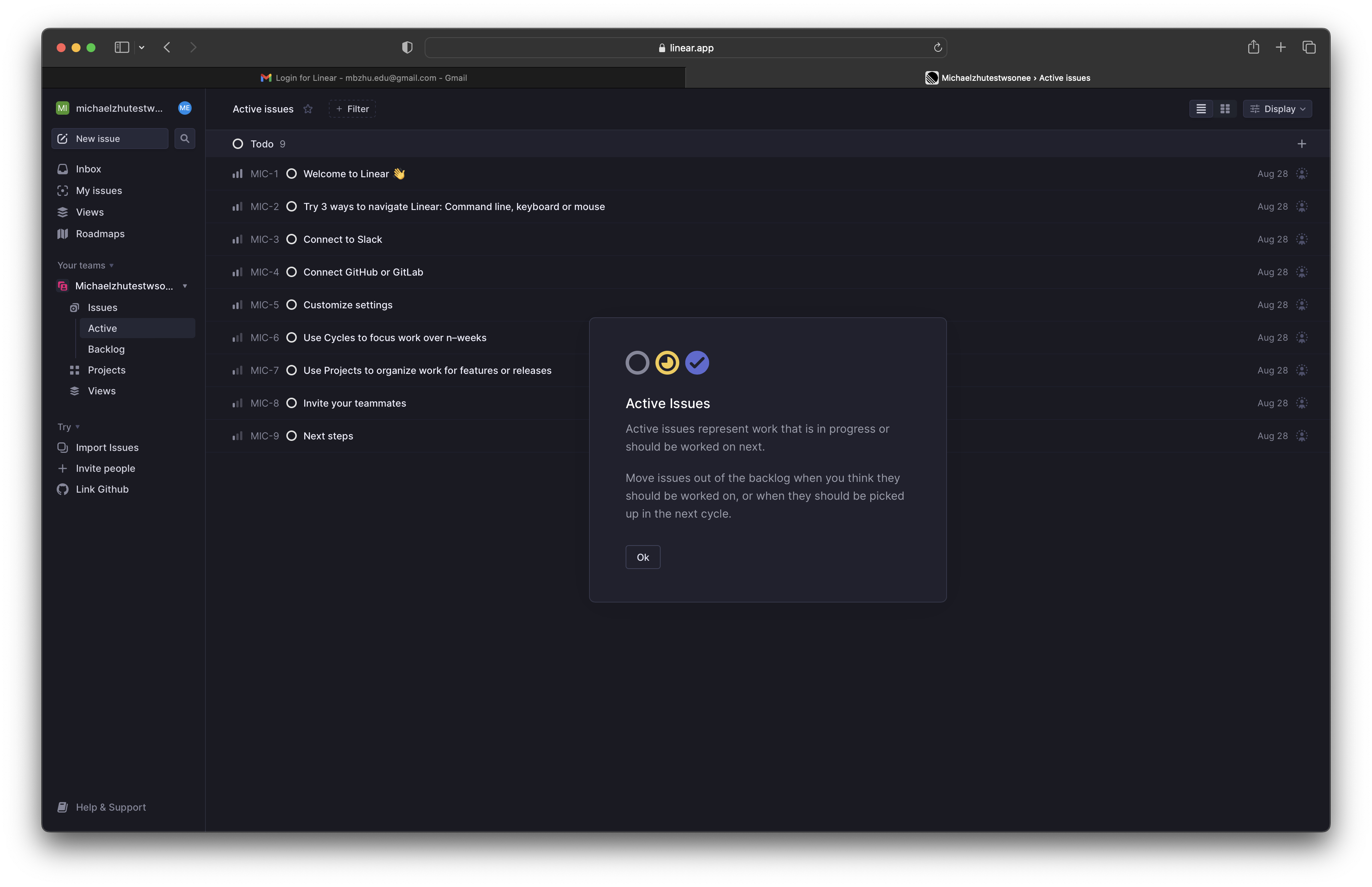
- after you complete the login flow, there is this weird popup about active issues
- i don’t really understand why this is here and why it is shown now?
- i like how they don’t show a checklist of onboarding todo items explicitly
- they show them as tickets that are integrated with the interface a user would normally use
- this helps encourage the user to explore the product as well as giving some explicit guidance if the user needs it
- it uses the product itself as onboarding, not the dashboard or product wrapper
- i also like how they have a ‘Try’ section in their sidebar
- the UI is the exact same as the team's UI
- so even though it is a permanent todo list it doesn’t stick out like a sore thumb, instead it fits seamlessly into the interface and it’s intuitive to the user how to remove it
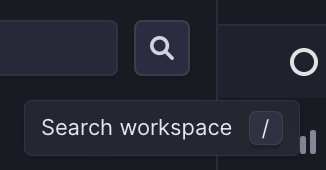
- the tooltip design stands out in that it's very functional
- it tells you what the button does in concise language and teaches you what keyboard shortcut you can use to speed up your workflow
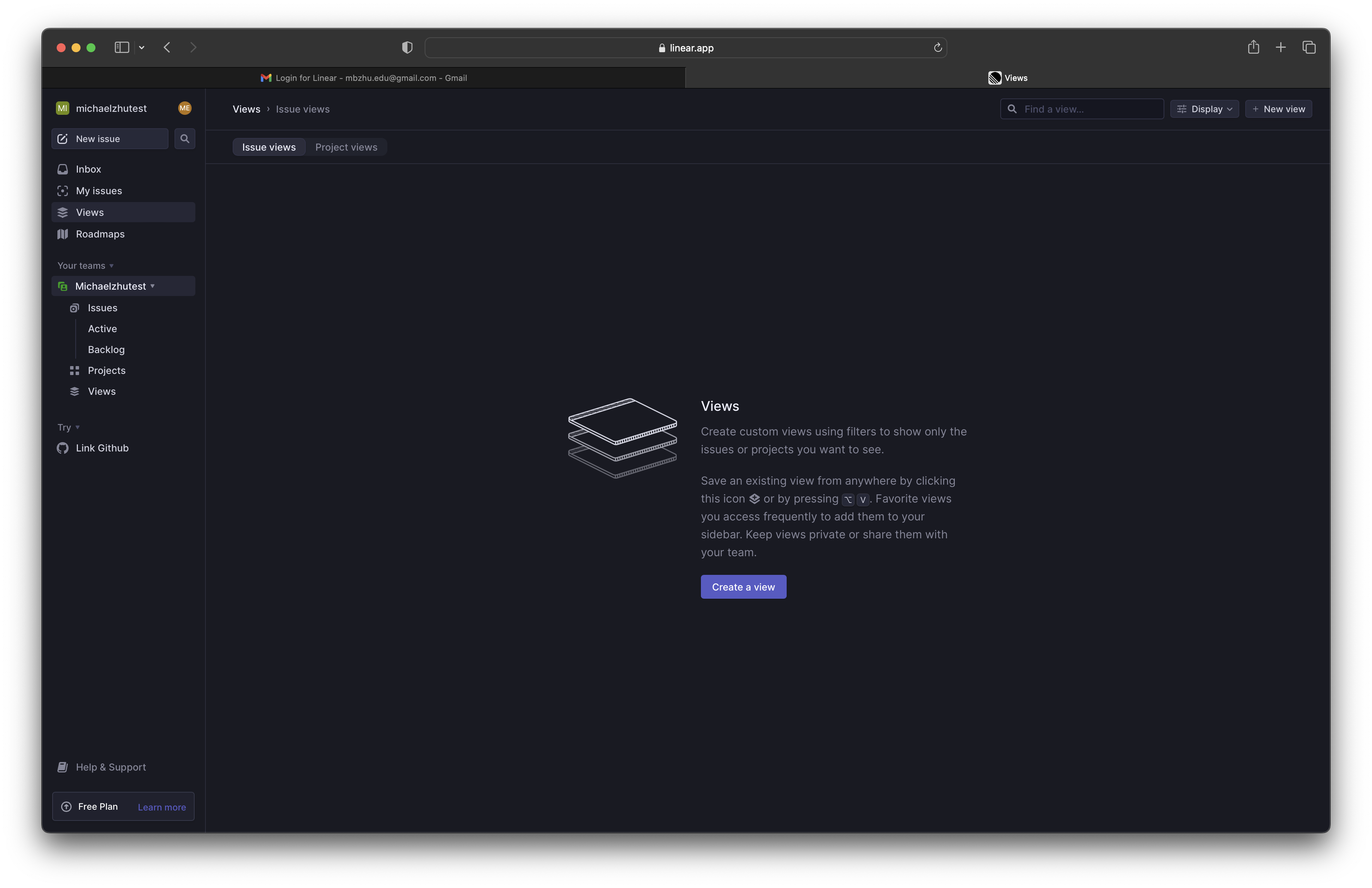
- very functionalal empty state that tells you what this panel is supposed to be used for and gives you a call to action to get started immediately
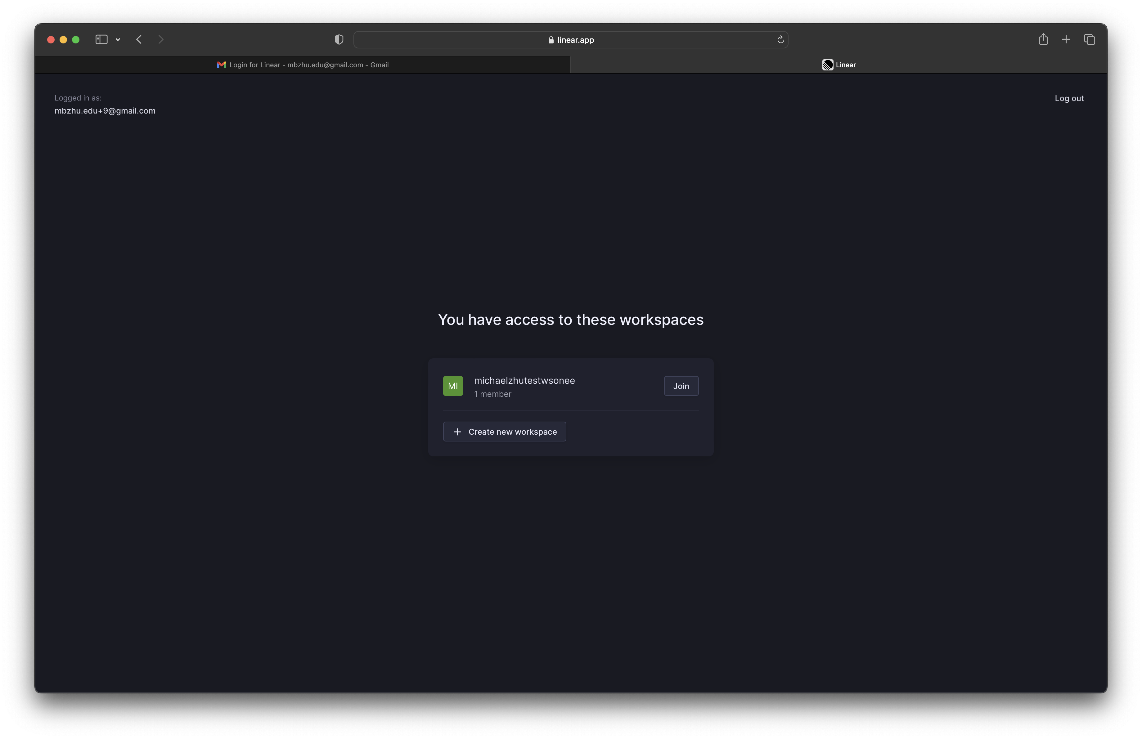
- i like how if you sign in with an account that already has access to a workspace it handles that appropriately